

This excerpt is from RADICAL CARTOGRAPHY by William Rankin, published by Viking, an imprint of Penguin Publishing Group, a division of Penguin Random House, LLC. Copyright © 2025 by William Rankin.
In 1994, the Berkeley geographer Bernard Nietschmann made a famous claim about the power of mapping in the global struggle for Indigenous rights. It was a claim about how the tools of historical oppression could be reclaimed by the oppressed: “More Indigenous territory has been claimed by maps than by guns. This assertion has its corollary: more Indigenous territory can be defended and reclaimed by maps than by guns.” The idea was that by putting themselves on the map—documenting their lives and their communities—Indigenous peoples would not be so easy to erase. Nietschmann was working in Central America, often heroically, during a time of violence and displacement, and he inspired a generation of researchers and activists interested in flipping the power structure of state-centric cartography on its head.
But despite the spread of bottom-up mapping projects in the past 30 years, perhaps the most successful example of Indigenous mapping actually predates Nietschmann’s call to action. Just one year prior, in 1993, the Inuit of northern Canada signed a treaty creating the territory of Nunavut—the largest self-governing Indigenous territory in the world—and mapping was central to both the negotiation and the outcome. It remains one of the rare cases of Indigenous geographic knowledge decolonizing the world map.
So why hasn’t the Inuit project been replicable elsewhere, despite decades more work on Indigenous mapping? The answer lies in the very idea of territory itself, and in particular in one of the most threatened parts of the Inuit landscape today: ice. The winter extent of Arctic sea ice reached a record low earlier this year, and a new low is predicted for the winter ahead. Yet the shrinking ice isn’t just an unshakable sign of Arctic warming; it’s also a poignant reminder of what Nietschmann got right—and what he missed—about the relationship between cartography and power. In particular, it shows how Inuit conceptions of space, place, and belonging are rooted in a dynamic, seasonal geography that’s often completely invisible on Western-style maps.
The story begins in the 1970s, when the young Inuit leader Tagak Curley, today considered a “living father” of Nunavut, hired the Arctic anthropologist Milton Freeman to lead a collaborative mapping project of unprecedented scope and ambition. Freeman taught at McMaster University about an hour outside Toronto; he was white, but his wife, Mini Aodla Freeman, was Inuit (she was a translator and later a celebrated writer). Freeman assembled a team of other anthropologists and Arctic geographers—also white—to split the mapping into regions. They called their method the “map biography.” The goal was to capture the life history of every Inuit hunter in cartographic form, recording each person’s memories of where, at any point in their life, they had found roughly three dozen species of wildlife—from caribou and ptarmigan to beluga, narwhal, and seaweed. Each map biography would be a testimony of personal experience.
After the mapping was split into regions, about 150 field-workers—almost all Inuit—traveled between 33 northern settlements with a stack of government-issued topographic maps to conduct interviews. Each hunter was asked to draw lines or shapes directly on the maps with colored pens or pencils. The interviewers stayed about 10 weeks in each settlement, visiting most hunters in their own homes, and the final participation rate was an astonishing 85 percent of all adult Inuit men. They collected 1,600 biographies in total, some on maps as large as 10 feet square.
Then came the cartographers, back in Ontario: one professor and a team of about 15 students. The first map below (Figure 1) shows how the individual map biographies were transformed into summary maps, one for each community. For every species, the overlap of all hunters’ testimony became a single blob, and then blobs for all species were overlaid to make a complete map. The second map (Figure 2) shows one of the finished atlas pages along the Northwest Passage. The immediate impression is that the Arctic is in no way an empty expanse of barren land and unclaimed mineral riches. It is dense with human activity, necessary for personal and collective survival. The community maps combined to show almost uninterrupted Inuit presence stretching from northern Labrador to the Alaska border.
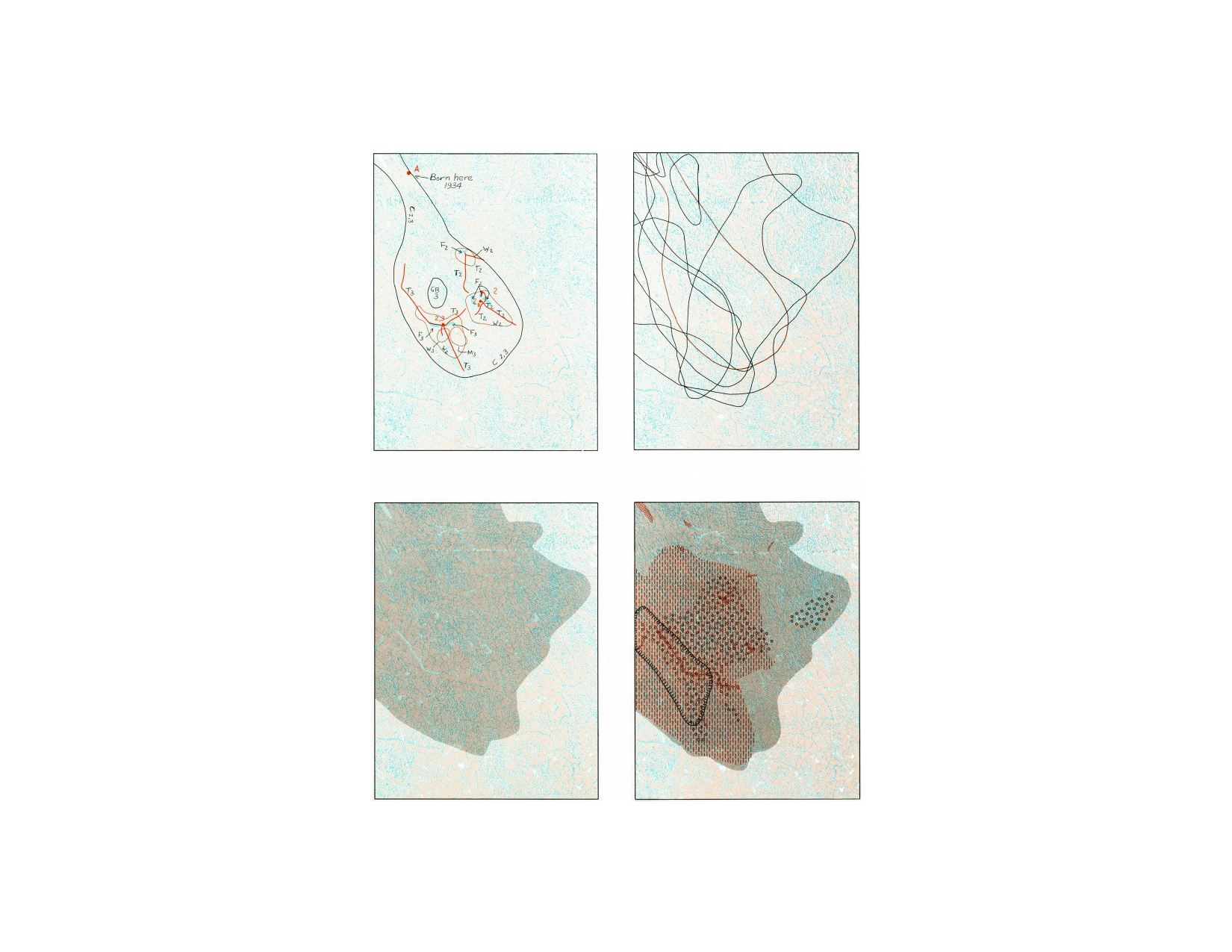
Figure 1: Top left is a simplified version of a “map biography” from a single Inuit hunter, showing his birthplace and the places he hunted caribou, fox, wolf, grizzly bear, moose, and fish at various points in his life. (The original biography would have been drawn over a familiar government-issued topographic map.) The other three maps show how multiple biographies were then combined into patterned blobs for all hunters and all species. (Map courtesy of William Rankin/ Penguin Random House LLC.)
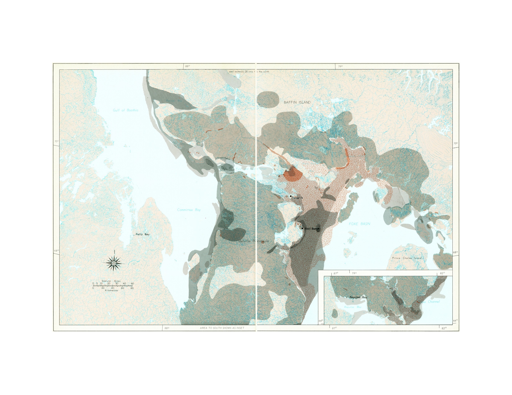
Figure 2: A two-page spread from the finished atlas showing the seven kinds of animals hunted from the settlements of Igloolik and Hall Beach, in an area about 500 by 300 miles: caribou, polar bear, walrus, whale, fish, seal, and waterfowl. (Because of the large number of individual species recorded in the map biographies, some species were grouped together in the final maps.) The blobs are a strong, even overpowering figure atop an unusually subtle ground. Notice in particular how difficult it is to distinguish land and water areas, since the dark shading extends beyond coastlines even for individual species. This map in fact includes the Northwest Passage—the famous sea route around the tip of North America—but the crucial Fury and Hecla Strait (named after the two British ships that first learned of, but did not navigate, the passage in 1822) is almost entirely obscured. (Map courtesy of William Rankin/ Penguin Random House LLC.)
Nothing about the cartography was meant to be subversive—or even controversial. For the cartographers, the only message was that the Inuit hunted a variety of species over large areas. But look again at the finished map in Figure 2. Yes, a foreground is layered over a background in the usual way, but the visual argument is strikingly different from a typical layered map in, say, a census atlas, where the foreground data doesn’t stray beyond crisp pre-existing borders. Here, in contrast, even the basic distinction between land and water is often obscure. The maps’ content is the facts of species and area; the maps’ argument is that Inuit culture is grounded in a substantially different understanding of territory than the one Western cartography was designed to show.
As a result, this new atlas shifted the negotiations between the Inuit and the Canadian government decisively. Not only did the maps provide a legal claim to the Inuit-used land, documenting 750,000 square miles—an area the size of Mexico—but also a claim to the sea, showing an additional 325,000 square miles offshore.
It took many years for the full implications to play out, but the erosion of the land–water boundary became central to the Inuit vision. At the time, wildlife on land was managed by the regional Northwest Territories government, while offshore marine species were the responsibility of centralized federal agencies. The Inuit used the atlas to win agreement for a new agency with equal responsibility over both. At the same time, the Inuit also improved their position by offering their offshore claims as evidence the Canadian government would use—not just in the 1980s, but even as recently as 2024—to resist foreign encroachment in the Northwest Passage. The final agreement in 1993 granted the Inuit $1.15 billion in cash, title to about 17 percent of the land in the “settlement area,” representation on several new management agencies, a share of all natural-resource revenue, broad hunting and fishing rights, and a promise that the territory of Nunavut would come into being on April 1, 1999.
It’s easy to count this project as a success story, but it’s also important to remember that it depended both on the government’s own interest in negotiation and on the willingness of Indigenous peoples, or at least their leadership, to translate their sense of space onto a map, solidifying what had previously been fluid. It also meant abandoning claims to ancestral lands that had not been used in living experience and provoking new boundary disputes with neighboring, and previously amicable, Indigenous groups. These tradeoffs have led some scholars to critique mapping as only “drawing Indigenous peoples into a modern capitalist economy while maintaining the centrality of state power.” But for the Inuit, the alternatives seemed quite a bit worse.
With the more recent proliferation of Indigenous mapping initiatives elsewhere—in Latin America, Africa, and Asia—the tradeoffs have been harder to evaluate. Most governments have shown little interest in addressing Indigenous claims, and when bottom-up mapping has been pushed instead by international nonprofits interested in environmental conservation, the downsides of mapping have often come without any of the upsides.
Yet it’s not just the attitude of the state that’s been different; it’s also the cartography. In nearly all these other cases, the finished maps have shown none of the territorial inversion of the Inuit atlas. Instead, Indigenous knowledge is either overlaid on an existing base map in perfectly legible form, or it’s used to construct a new base map of a remarkably conventional sort, using the same visual vocabulary as Western maps.
Did the Inuit project just show the data so clearly that its deeper implications were immediately apparent? No, not really, since the great irony here is that the cartographers were in fact quite dissatisfied. Follow-up surveys reached the conclusion that the atlas was only “moderately successful” by their usual mapmaking standards.
The Inuit atlas was a kind of happy accident—one that doesn’t conform to any of the usual stories about Indigenous mapping, in Canada or elsewhere. The lesson here isn’t that maps should be as Indigenous as possible, or that they should be as orthodox as possible. These maps were neither. My take is simpler: the atlas shows that maps can, in fact, support alternative conceptions of space—and that showing space in a different way is crucial.
The possibilities aren’t endless, but they’re broader than we might think. Plotting different sorts of data is a necessary step, but no less important are the relationships between that data and the assumptions of what lies below. For the Inuit, these assumptions were about land, water, and territory. These were in the background both visually and politically, and they were upstaged by an unexpectedly provocative foreground. The layers did not behave as they were meant to, and despite the tradeoffs, they allowed an Indigenous community to fight for their home and their way of life.